Tackling typography? Here are the best typefaces in Adobe Fonts for 2022.
Adobe Fonts is a massive collection of typefaces that comes free with your subscription to Creative Cloud. Over 20,000 fonts are available at your beck and call, but how can you decide which one is the best? If you’re overwhelmed by the possibilities, we’re here to sort through the chaos and help you find your new favorite fonts.

Typography is an important part of design. There is simply no easier way to communicate a message with your audience than by simply spelling it out for them. However, not all letters are created equal. No, we’re not talking about Windings, but the font you choose has a palpable effect on your reader, so you have to choose wisely. In this article, we’ll show you:
- The difference between Serif and Sans Serif
- Why you should choose legible fonts over stylish ones
- How to choose fonts for headers versus paragraphs
- How to keep your type clean
- How to choose fonts that go well together
- How to pick a more unique, special font
- Options for Serif, Sans Serif, Script, and Handwritten
What is the difference between Serif and Sans Serif?
You probably already know the difference between a Serif and a Sans Serif typeface; if not, read this first. Typefaces are generally sorted into two categories. Serif fonts come with a decorative stroke, usually around the bottom of the character. These “feet” add a sharp look that enables the letter to attend black tie events without causing a stir, but can seem overdressed when advertising an all-you-can-eat burrito bowl bonanza.

Meanwhile, Sans Serif typefaces dismiss with the pomp and circumstance, leaving only naked letters showing off the purity of the form. These are clean and simple designs that effectively communicate with the viewer, but they aren’t welcome in some country clubs (and might elicit a few gasps from the more discerning audience members).

So now what? How do you go about differentiating from the thousands of options of typefaces available?
How to choose the best typeface in Adobe Fonts
Choose legible fonts

This may seem obvious but some typefaces are really hard to read, especially if they are on screen for 3 seconds. Make sure to pick a typeface that is easy to read. Aim for clean lettering, a thicker weight, and even spacing. If your letters are too crunched together, the reader might not be able to parse out the words in time. If they’re too spread apart, words get lost in the chaos.
Look for a font with a variety of styles

Most of you understand how to use Italics, Bold, and Underline to provide emphasis, however not every font family is going to have these options. When selecting a typeface, check that there are variable options for weights and styles, especially with regards to Header (Display) options. If your client has a brand book, this probably won't matter; but if you have to design titles which involve text, then you will probably need a typeface that can accommodate the script from a single word to a sentence. Look for typefaces that work well when kerned tightly, as sometimes your titles will have to be big and prominent on screen.
Look for clean and flexible characters

If you’re designing posters or static text, you can be a bit more flexible with your font choices. However, if you’re animating your letters, you need to be more considerate. More often than not, you’ll be dealing with titles rather than setting paragraphs of text. You may even need to do some "stretchy type," which is still a popular style.
Make sure to pay close attention to the geometry of the individual characters (lowercase and uppercase). The cleaner the geometry, the fewer issues you can potentially come across if you need to animate the individual letters.
Choose typefaces that work together

Make sure the typefaces you choose work well together. Contrast is important when it comes to good design, and it is no different when it comes to typefaces. Choose typefaces that have good visual contrast with each other when combined.
Test out your fonts and find that special “something”

Adobe Fonts allows you to test out your typefaces so you can see exactly what you’re getting. When selecting typefaces, I like to look at my script first and get an idea for the words that I will have to animate. Then I type those words into Adobe Fonts so that I visually see what those words will "feel" like in a typeface.
I also look for that “special glyph” that sets one typeface apart from the others. It’s easy to overdo it, so make sure the typeface is well designed and that the letters don’t call too much attention to themselves.
Here are some recommended fonts to get you started on your next project
With all that in mind, there are a few fonts that we feel are capable of knocking out almost any project. Here are our recommendations for go-to fonts so you can jump right into your next project.
Serif option

Geller is a beautiful and clean serif typeface designed for both headlines and text. The clean elegant glyphs are reminiscent of more traditional typefaces, but yet it has a modern, fresh, clean look. The italics are just delicious. Plenty of options for your projects.

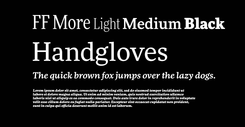
FF More combines the cleanness of a sans serif with a slab serif. Handy when working on a project that needs a very clean design.

Freight has plenty of weights to work as titles or subtitles. The italic options have a chiseled almost pen like quality that can add some character to a design.

Abril is a workhorse typeface that comes with many options and works in most cases without much kerning. Well designed and clean enough to work on a wide array of projects from corporate to fun, very versatile.
Sans Serif option

When you want to look sharp without dressing up, Museo Sans is the Sans Serif choice du jour.
Museo Sans has not only enough options when it comes to weights—especially with its hefty Museo Sans Display Extra Black—but the typeface also has rounded and condensed versions. There are enough variations that should accommodate most words and phrases needed in your project.

Futura has been around since 1927, and since then has been a favorite amongst designers because of its clean geometric style. If you need a typeface that will stand the test of time—and work within a clean design—Futura is a safe option.

Owners offers a ton of options—including wide, which comes in handy when you need to fill the screen with a short word. Owners design is clean but friendly, which makes it a good candidate for fun branding campaigns.

Cairo has a squarish style that can come in handy on projects that need more angular designs, or tight blocks of text in your titles.
Script option
What about script fonts and handwritten fonts?
While these fonts are probably only reserved for select projects, it is good to have a few options at hand for those times when they are needed. Same principles as before apply.

Learning Curve is a script typeface which also has a very mono design to it. This is handy for us motion designers because most of the time we will be revealing script fonts as if they were being written on. Having a script typeface which is the same width throughout will facilitate the process a lot. You are welcome!
Handwritten option

Tekton is a well designed font that rides the line between handwritten and digital. It is clean and simple. An interesting thing about this typeface is that the different fonts seem to have slightly different slant angles, which can come in handy if you are needing to go for that "handwritten" look.


