3D artist Wes Cockx on creating a visual language for designers and developers.
Wes Cockx is a freelance 3D artist known for his distinct color palettes and lighting, as well as uses of glass and transparent objects, he has worked with dozens of major clients, including Nike, Google, Instagram, Vans, Apple and most recently Microsoft.
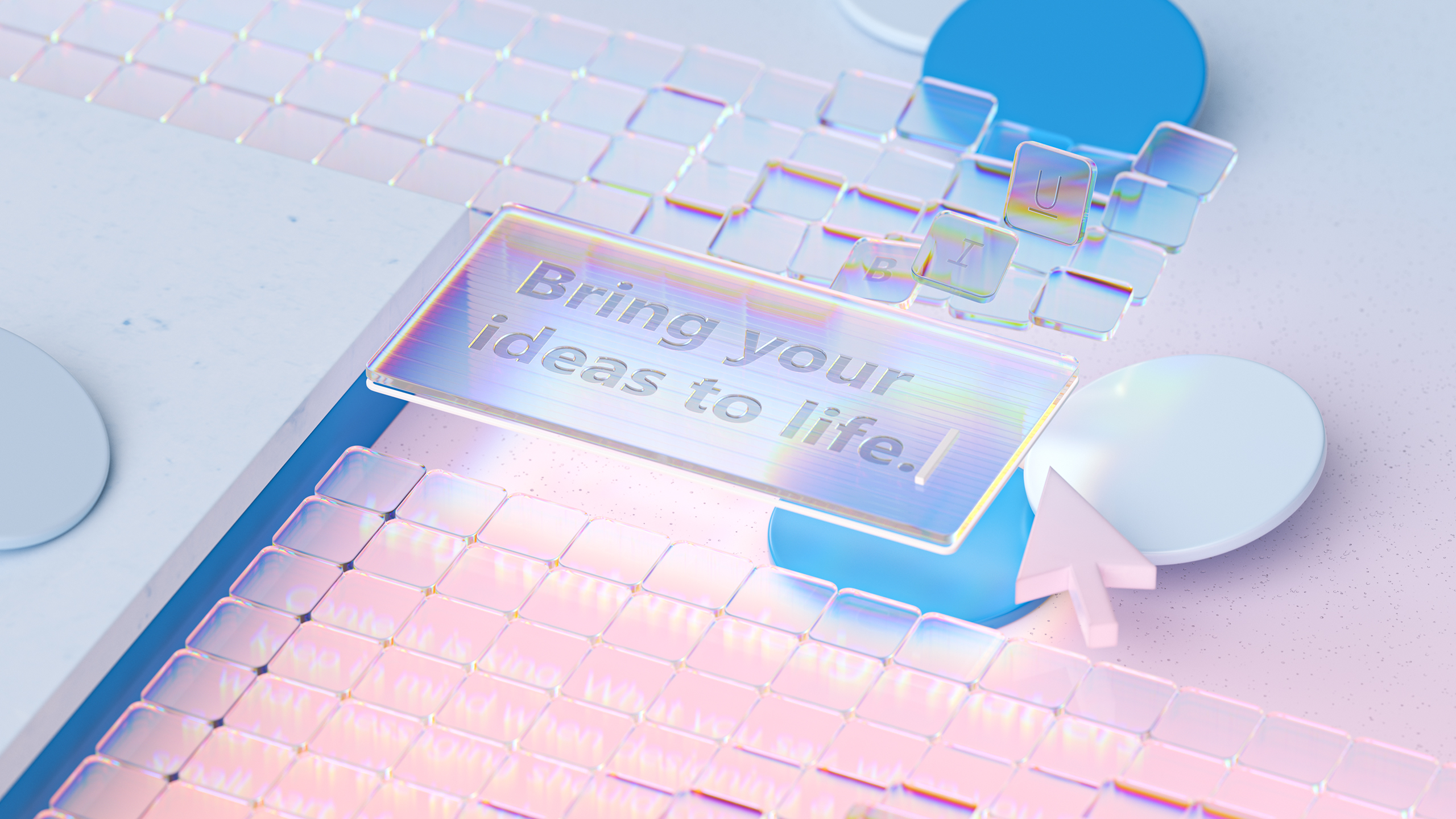
In collaboration with Microsoft and Designer Nando Costa, Cockx used Cinema 4D, After Effects, Photoshop and Redshift to concept and create a collection of key visuals for Microsoft’s Fluent UI.
We talked with Cockx, who lives in Brooklyn, New York, about his work on Fluent, Microsoft’s open-source, cross-platform design system for developers and designers. Here’s what he told us.
How did you get started working in 3D?
Cockx: I studied graphic design, but without any 3D or motion. It was very old school and after that, I worked a few years in branding, mostly with Illustrator and Photoshop. I never felt comfortable in branding, so I started doing more illustration work in my free time.
I knew a bit about 3D in those days, but I thought it was only used in movies and maybe architecture and video games. Then, I started seeing some 3D in advertising as illustrations and that really clicked with me.
I tried several types of 3D software and chose C4D. I never looked back and tried to put it to work at the agency I was with at the time, but they weren’t interested. I started freelancing on the side and, in a couple of years, I had enough freelance work but was also working full-time at an agency.
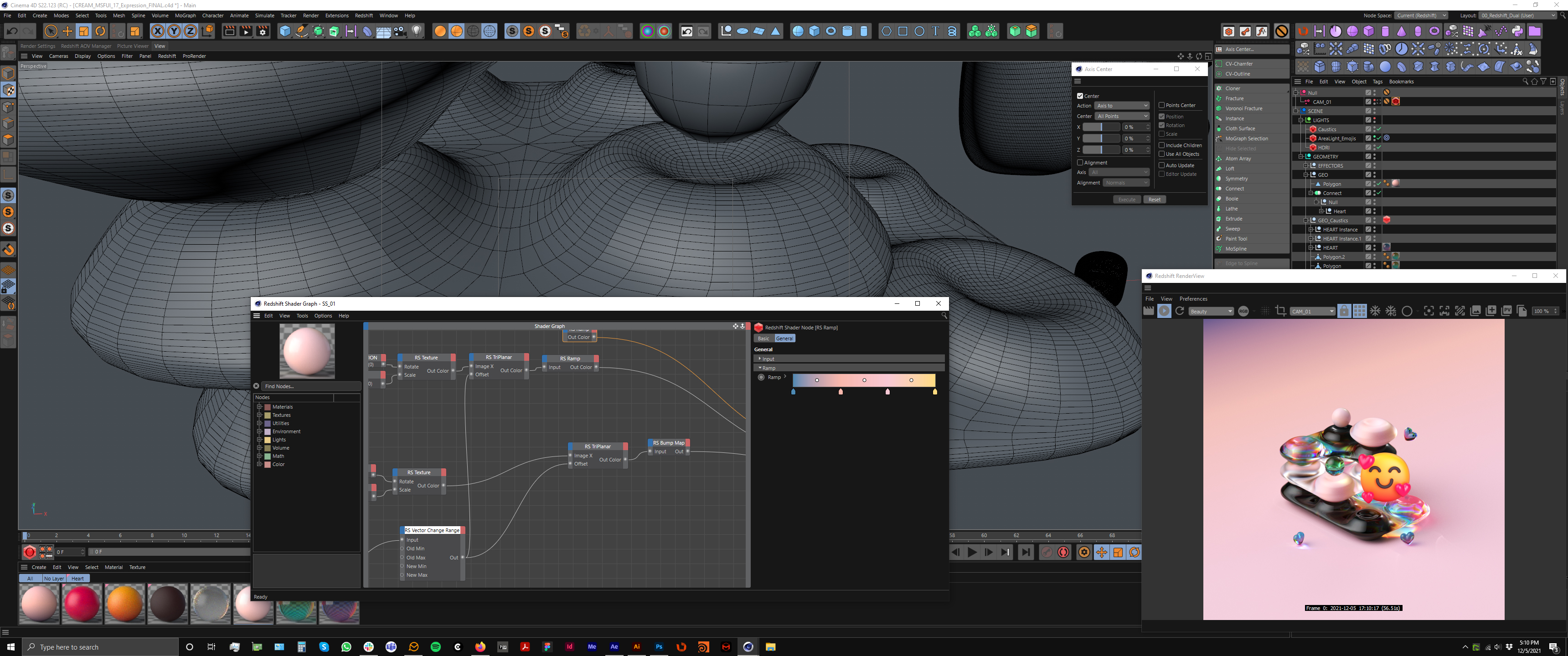
I was scared to jump fully into freelance, but I got an offer to work full-time for three months full-time for Disney, so I took a chance and went freelance. I had no clue what I was going to do after that and figured I could always find a new agency job.
Fortunately, I have been very lucky and have never had to look back. It’s been ten years now, and I have been able to experiment quite a bit. I’ve found my own style in the past five years and I love my job. Often, I can’t believe I do this as a profession.
What was it like working with Microsoft and Nando Costa?
Cockx: This was the first of several collaborations with Microsoft, and my first with Nando, which was a real pleasure. I’m a big fan of his work. One of the things I loved was that the brief contained only references of my own work instead of someone else’s work.
There were no mood boards with other agencies' work, just some references to other Microsoft work. Nando sent about 15 keywords with a real short brief and a lot of Fluent documentation. It felt from the beginning that he was coming to me to do my style.
So you started with minimal references. Where did you go from there?
Cockx: The brief was mainly those 15 keywords. He gave them to me and just said, ‘Have fun.’ I was like, ‘Where do I start?’ So I started researching and came up with a few ideas and it became very organic from there. We were experimenting with things and trying new stuff until the very end. It was all R&D, which was really fun.
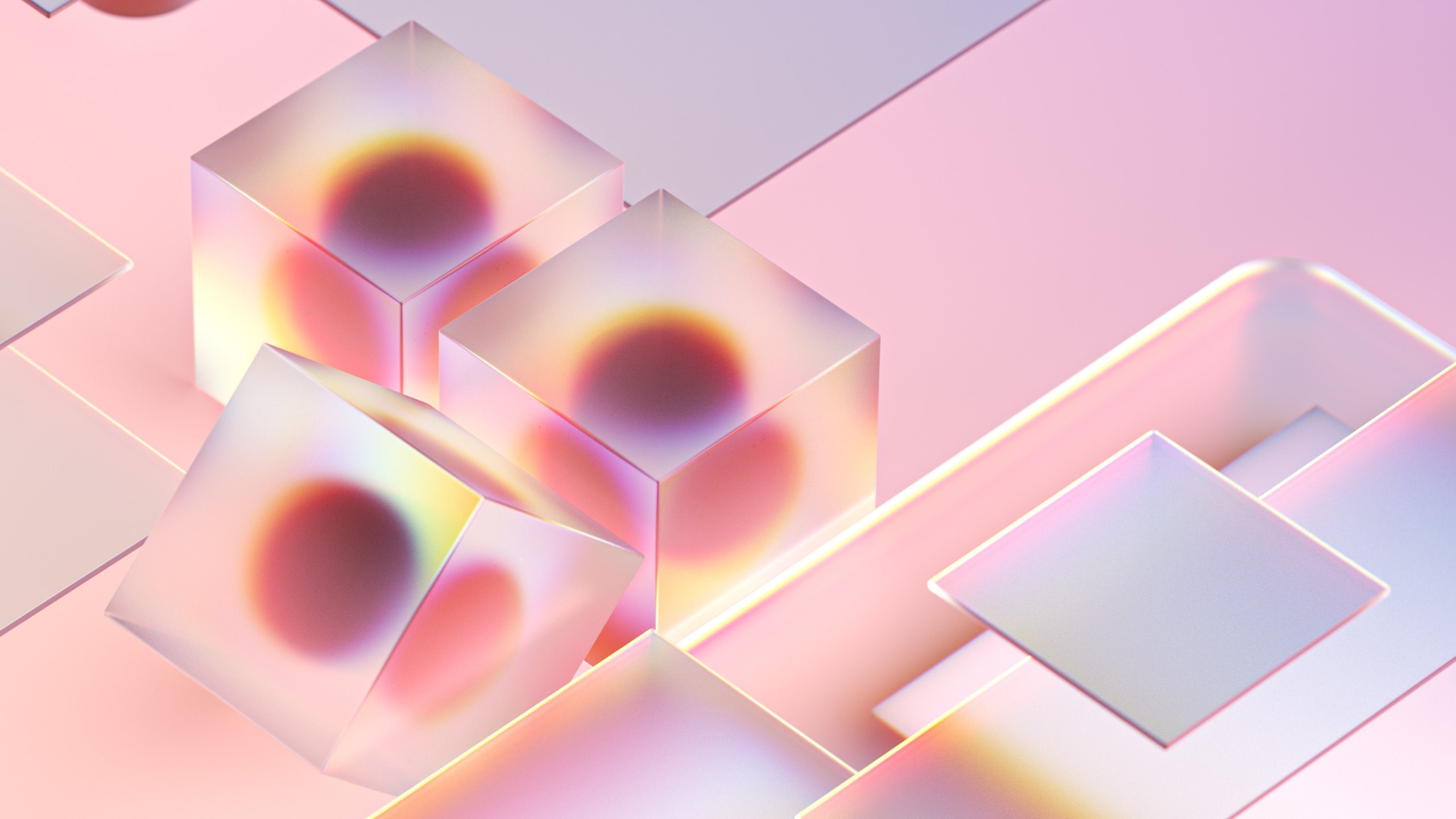
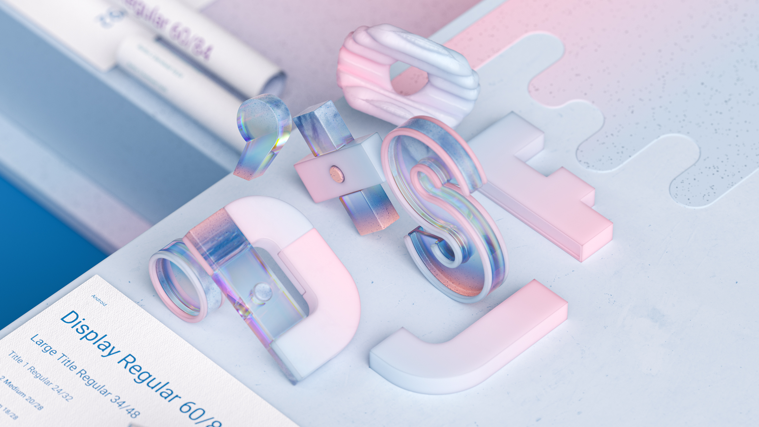
I started by researching the meanings and ideas behind the concepts on the Fluent website and documentation they gave me. From there, I used my notes to start the concepts. The project felt like my whole life for about two and a half months.
There was just so much stuff, probably 70 or 80 percent of it didn’t get used even though we really liked it, and they were good concepts. I think there were somewhere around 450 renders.
Briefly describe your workflow and the tools you used.
Cockx: I used Photoshop heavily for compositing and post with some After Effects for the animations. There’s a little bit of Houdini in this project too, but I don’t think of myself as a Houdini artist. I know some techniques but would not be able to do a full production in it. I use it more as an extra toolbox for Cinema 4D.
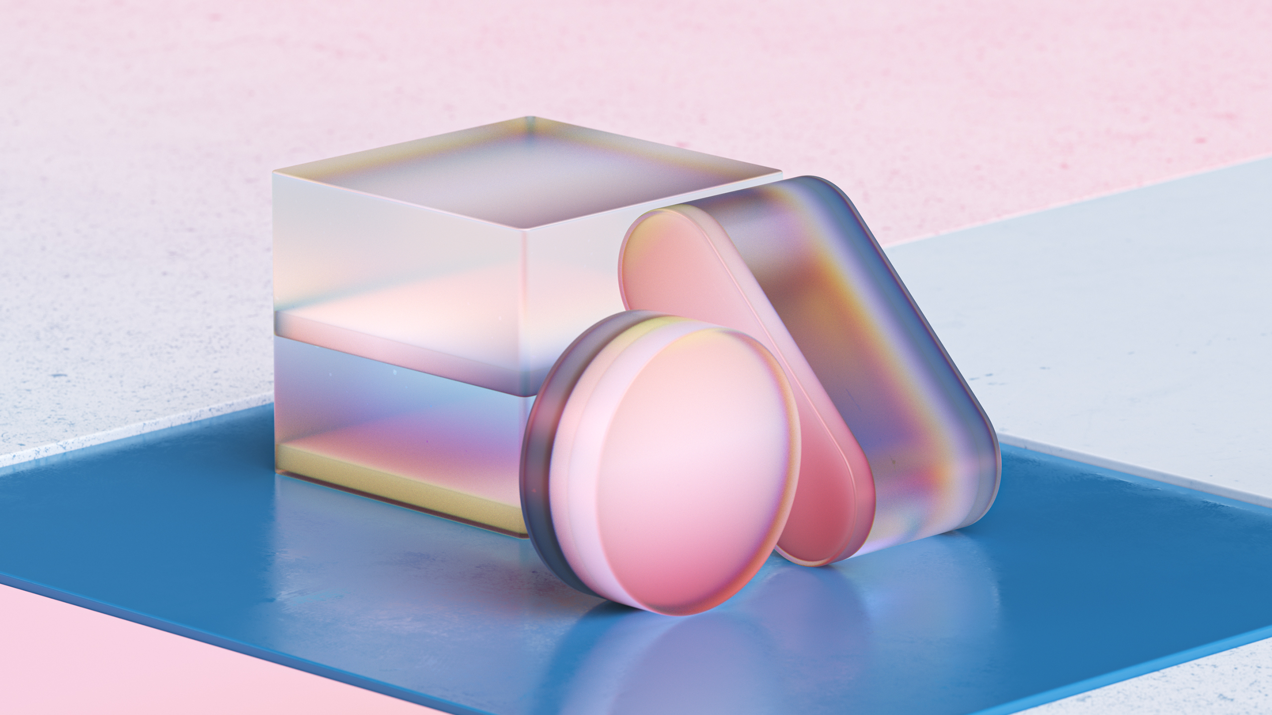
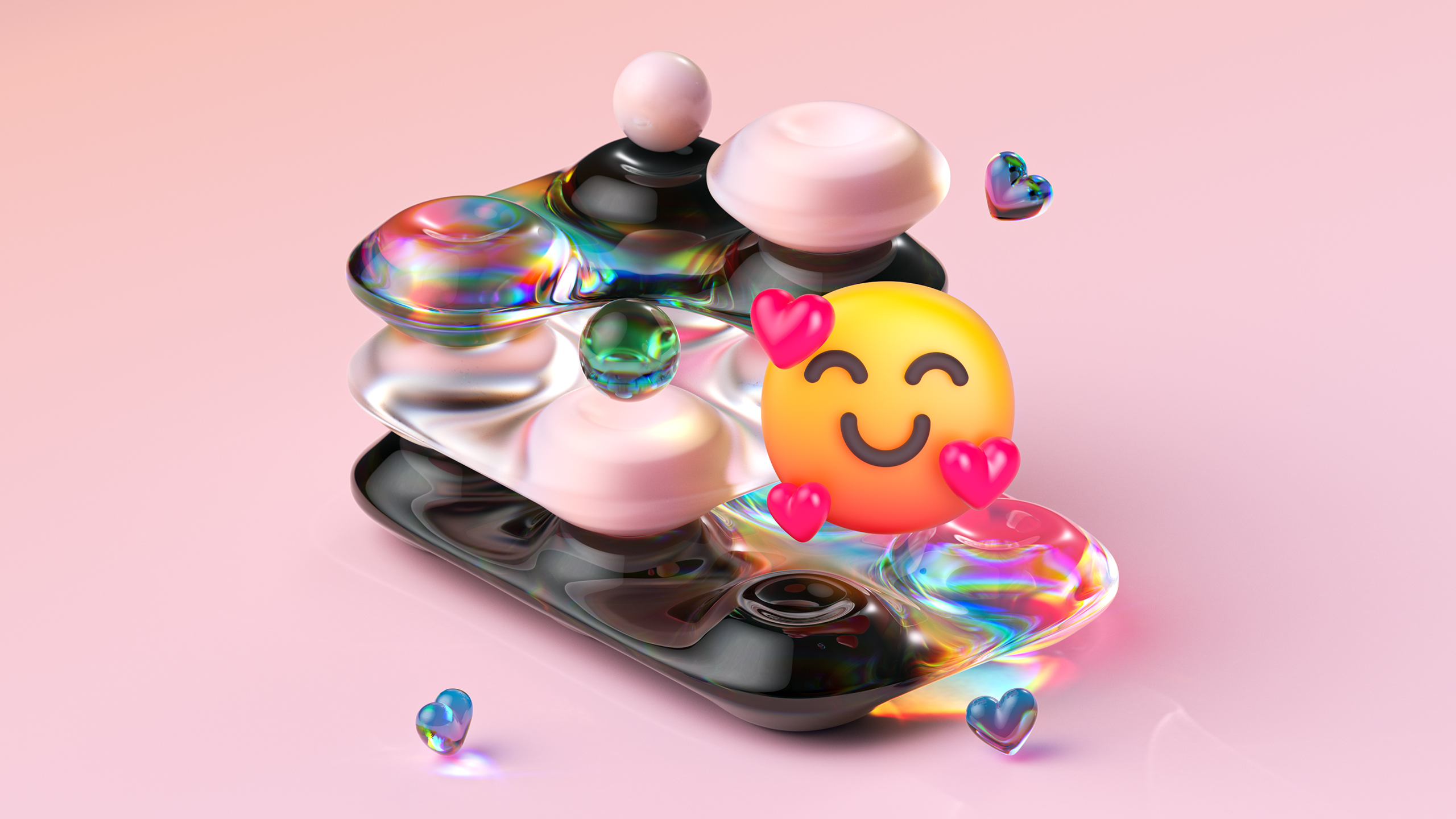
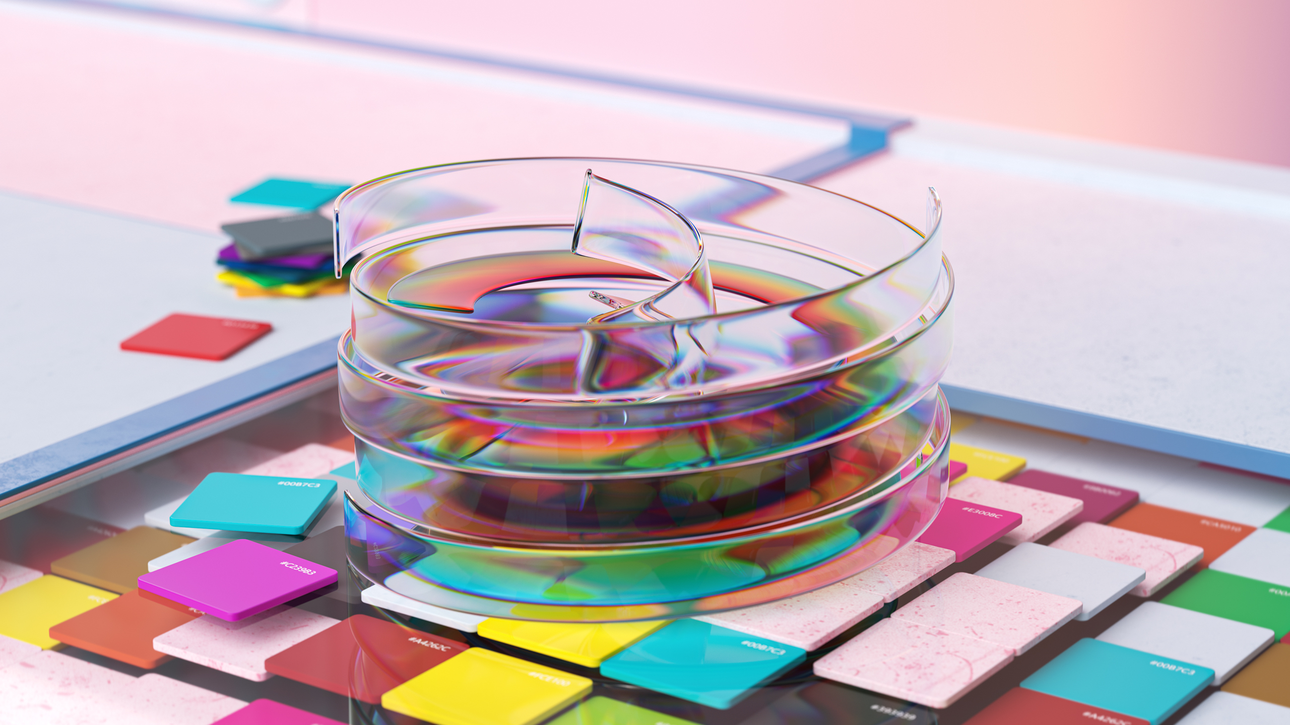
I switched to Redshift a few months before I started this Microsoft project, so I just jumped in because that’s the best way to learn. I really like working with Redshift. One render (above) was a big moment for me because it’s when Redshift really clicked in my head
It was the most minimal of renders, and I remember stumbling on this technique with materials and lighting by accident. It’s still one of my favorite renders that I have ever done, and I would have no idea how to set this up and render it clean in Octane or V-Ray.
What are some of your other favorite renders from this project?
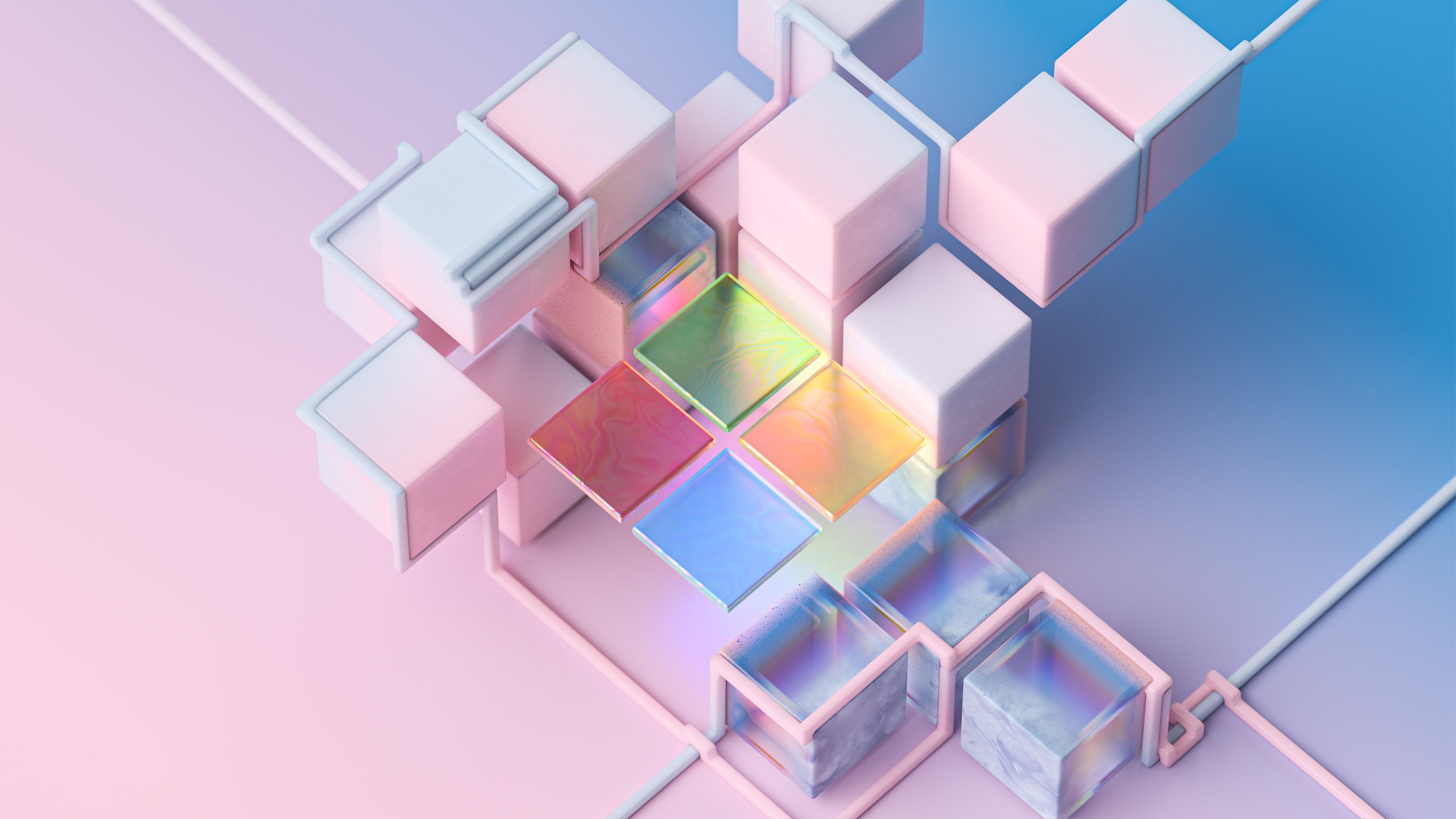
Cockx: The Microsoft logo is also one of my favorites. I think it was the last image I did for this project. It has the logo and some cubes, and I added some elements that look like pipes. I guess that’s what you’d call them, and I’ve been using them a lot in my personal work to tie things together.
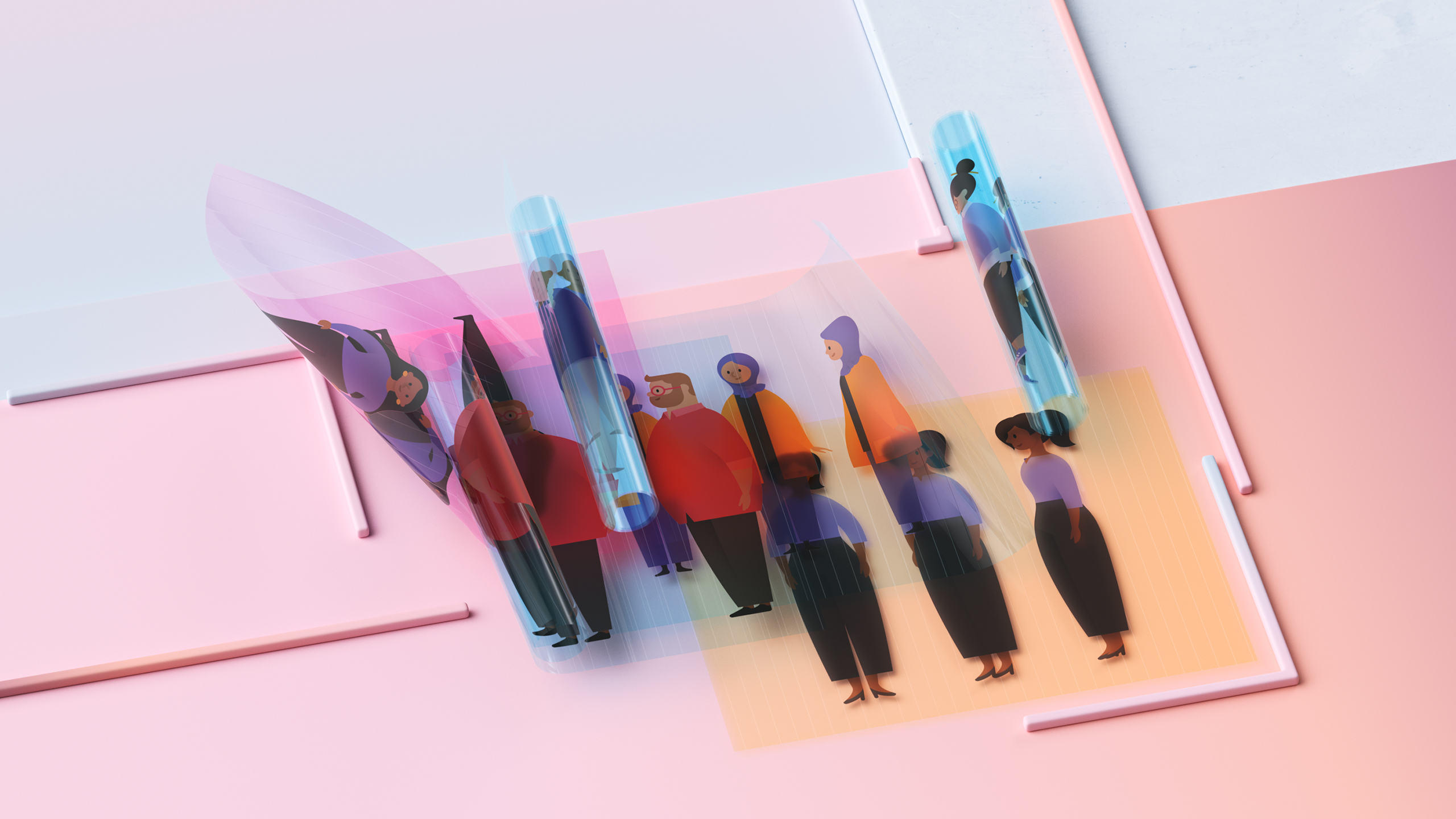
I also really like the one with the characters from Microsoft’s character library. I used Illustrator and Photoshop to make custom material maps and Redshift’s Thin Walled option to create the transparent objects. It’s great because you can see through it to what’s below, so it’s a really nice effect for things that don’t have modeled thickness, like sheets of plastic.
What did you enjoy most about this interesting project?
Cockx: From start to finish it was a very organic process with an opportunity for me to push my ideas and concepts. When I delivered the finals in this project it felt like it was really me, which is a very rewarding feeling. I’m still very thankful to Nando and Microsoft for letting me do my own thing with the project.
Michael Maher is a writer/filmmaker from Dallas, Texas.


